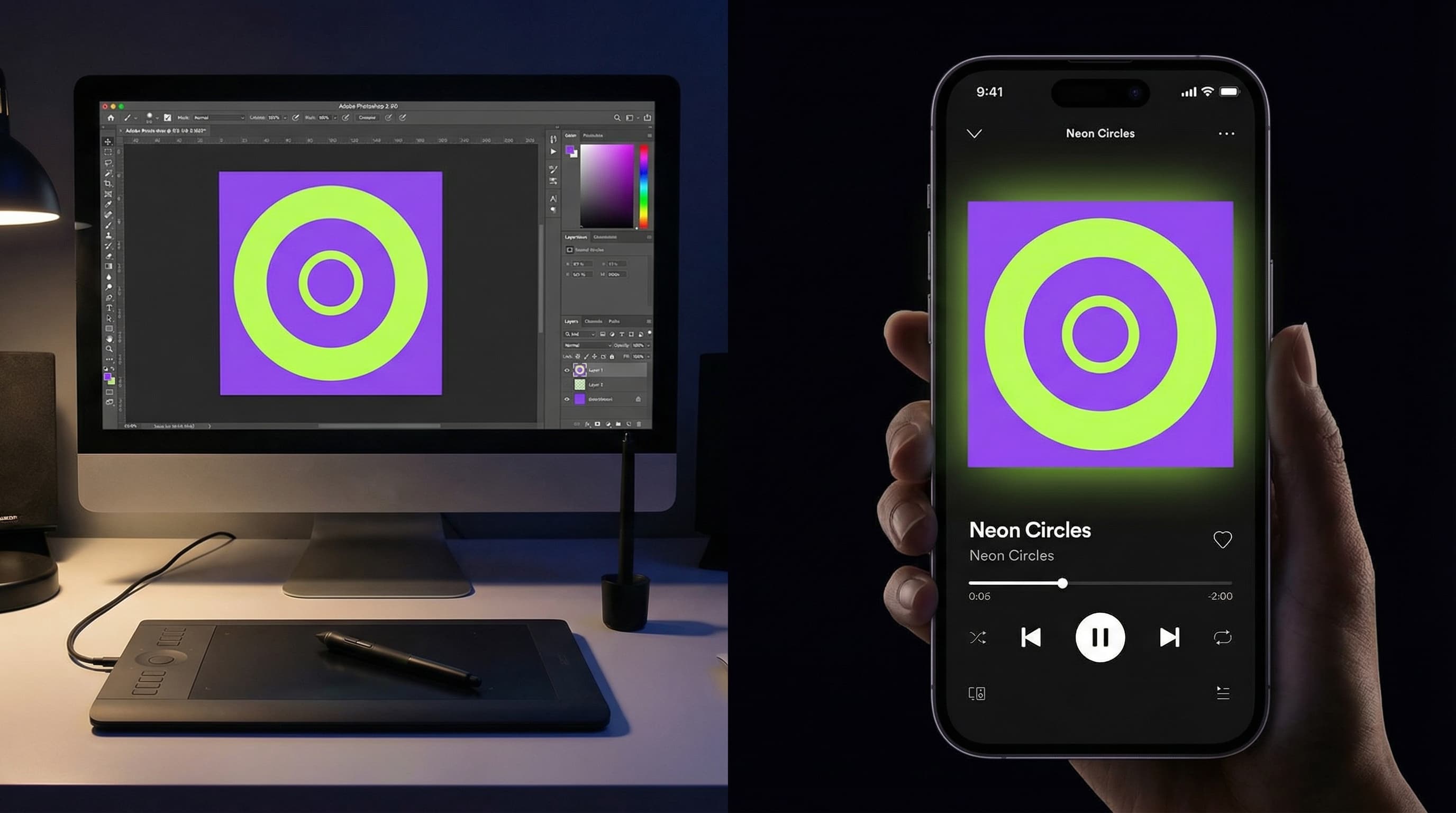
In the digital streaming era, your cover art is your digital billboard. Before a listener hears a single note of your new track, they are judging its quality based entirely on the visual packaging. In 2026, where millions of tracks are competing for attention on the dark-mode interfaces of Spotify and Apple Music, a generic or poorly designed cover is a guaranteed way to get skipped.
To give your release the best chance of algorithmic success and editorial playlist placement, you need to understand both the psychology of digital design and the strict technical rules of the streaming platforms.
1. The "Thumb-Stopping" Power of High Contrast (A Case Study)
To understand what makes a great cover, let's look at the official artwork for our DistroVibe Signed editorial playlist. If you analyze this cover, you will notice it doesn't use cluttered backgrounds or messy fonts. Instead, it relies on a high-contrast duotone aesthetic. The solid, vibrant purple background immediately pops against Spotify's black user interface. The artist is stylized in shades of dark purple and neon green, wearing a silky shirt and a pearl necklace, looking over their shoulder. This creates a retro-yet-futuristic vibe.
Furthermore, the typography is incredibly intentional. The word "distrovibe" is in a solid, bold white sans-serif font, while the word "signed" uses a thin, neon green outline that slightly overlaps the artist's shoulder, creating a 3D depth effect. This is the exact level of premium branding independent artists should aim for. You don't need a massive budget to look like a major label artist; you just need a cohesive color palette and a clear focal point.
2. The Golden Technical Rules of Formatting
Even the most beautiful artwork in the world will be rejected by stores if it doesn't meet their strict technical specifications. To ensure DistroVibe can deliver your music to 150+ stores without delays, your art must be:
Perfectly Square: An exact 1:1 aspect ratio.
High Resolution: While the minimum is 1400x1400 pixels, we highly recommend submitting 3000x3000 pixels to ensure it looks crisp on Retina displays and smart TVs.
The Right Format & Size: Use JPG or PNG files, keeping the file size under 25MB.
RGB Color Space: Always export your artwork in RGB (for digital screens), never CMYK (which is for physical printing). Uploading CMYK files will cause color distortion or outright rejection from stores.
3. Apple Music's Unforgiving Text Rules Many artists fail their distribution quality check because of the text on their cover. Apple Music's review process is notoriously strict when it comes to metadata matching. If you choose to put text on your cover art, it must match your release metadata exactly—including punctuation. If your track is submitted as "The Blueprint" but your cover art just says "Blueprint", it will be rejected.
Additionally, streaming platforms explicitly ban the following on cover art:
Social media handles (e.g., @yourname)
Promotional text (e.g., "Available on Spotify" or "New Single")
Web URLs or pricing info.
Generic, reused artwork across multiple different releases.
4. Extend Your Art to Spotify Canvas Once you nail your static cover art, bring it to life. Spotify Canvas allows you to upload a 3-8 second looping vertical video that plays while your track streams. By animating elements of your cover art (like making the neon green text glow or adding a subtle VHS glitch effect to your duotone portrait), you can increase track shares by up to 145%.
Your cover art is an invitation to your sonic world. Keep your designs striking, ensure your text perfectly matches your metadata, and let DistroVibe deliver your masterpiece to the global stage.